

Outlit is built for those who want to do cool things. To be spontaneous. To connect to others who share their passions. Outlit makes all of that easy through one events app. You can search, discover, and share on one platform. No more wasted time or effort. Spend less time searching and more time doing with Outlit.

We chose this idea because in college we always found out about events after the fact. There were 12 event websites on our school domain, and countless apps to check. We tested our concept by signing people up for an email calendar of events in the area. We had over a thousand students sharing our list, and when we started on the mobile app, even our university approached us about white labeling it for our school.
Since university students were our customers, we set out to interview a diverse group of students with a range of interests and hobbies. Our team performed empathy interviews with students from Greek Life, Club Sports, Varsity Sports, and students that participate in no organized recreation.
What we discovered was intense dissatisfaction with access/awareness for events one and off campus. These students spoke specifically to issues they had with campus tools as well as social media platforms. We were confident in the problem we discovered, and set out to discover the right solution.


We needed to test what information students wanted access to, and how they wanted access. We created and distributed an email list of events for students in the Blacksburg area. This helped us understand the types of events and services that students were really looking for.

Once we understood what information students wanted, and how they wanted it organized, we began to see an increase in the number of people sharing our list around campus. However, as the list got longer, we saw a decrease in popularity and began brainstorming and mocking up an app that could display filtered events on a map and calendar.

We drew app mockups that incorporated the key elements to the user experience. We kept components as modular as possible to cut down on the amount of development work needed on the front end. Similarly, we decided to build the app cross-platform using React Native.

After confirming the desired user experience with our original interviewees, we moved onto adding some UI components to our mockups using Sketch. We continued to iterate on feedback until we were content we had a solid foundation. Our branding was based around exclusivity, and quality.

We approached the Graphic Design department at our school to source student designers that could make our mockups look more professional. After a few weeks, we had beautiful mobile app designs, a unique logo, and the desired user experience.

The Map and Calendar interfaces were the most critical component to the application. By showing the number of events going on around campus, students realized how much they were truly missing out on.
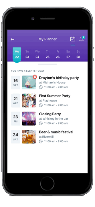
By adding in the filter options, students were no inhibited by too much information to sift through, and could get straight to the events and experiences they wanted.

We tested our app on the MIT Campus with Orientation events. We knew incoming students had only 2 weeks to attend hundreds of events to determine their preferred dorms for the rest of their freshman year. Prioritizing which events to attend was difficult without easily mapping times and locations of events together.

Immediately following Orientation was Greek Life Rush, another chaotic time for students to attend many events critical to an important social decision. By the time Rush was over, we had over two-thirds of the Freshman class using the app to discover new experiences on Campus. We handed out fliers on campus, and put posters up in dorms to get further word out about our platform.

Finally, we approached the Events Director at MIT with our platform and success. We learned a lot about their goals for campus engagement, and what would be needed for buy in from the school as a partner.

Want to start a conversation?
Reach me through LinkedIn or email.